DOPE
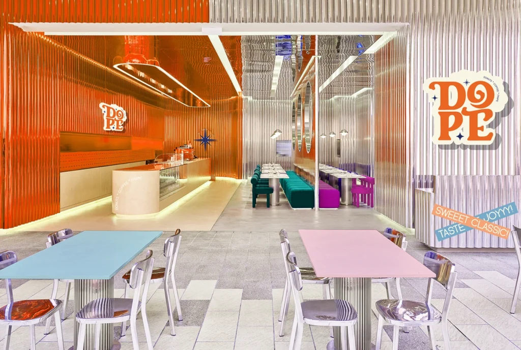
DOPE is an urban café brand inspired by the fusion of bold street style and café culture. The concept revolves around crafting an identity that feels playful, modern, and indulgent, reflecting the café’s signature offerings of donuts, coffee, and whips.
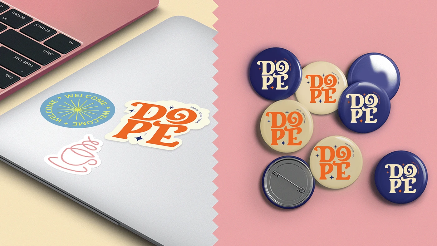
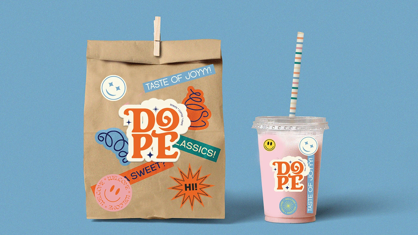
The design language embodies an expressive and youthful tone, merging urban aesthetics with a touch of nostalgia. The typography was developed to evoke the texture and flow of coffee whips and glaze, while incorporating visual cues from café treats like donuts and croissants.
The identity sketch explores the formation of the wordmark “DOPE” as a living illustration, with each letter designed to represent an element of café culture. The dripping edges, swirl patterns, and soft glaze-like contours collectively capture the café’s warm, inviting, and slightly rebellious vibe.
Client
DOPE Urban Café
Year
2025
DELIVERABLES
Brand identity concept, logo sketch development, and visual direction
Role
Senior Visualizer